There's been a lot of discussion about the new Miami Marlins logo. For those of you who do not know, "Miami Marlins" is the new name for the team formerly known as the Florida Marlins. (Yes, this is a baseball post.) Now, since the Marlins are in the NL east, no one ever gives them a chance. (Come to think of it, no one would give them a chance against anyone, not even the Cubs.) Since no one ever gives them a chance, this team is always being heavily looked down upon. Is it because they're a bad team? No. There are worse teams, and they seem to get neutral attention. I think the media just gets a kick out of talking smack about the Marlins. (Here on out, I'll be calling them "The Fish.") So why am I bringing this up? Well because EVERYTHING 'the Fish' do gets nationwide hatred, no matter what. This is the former Marlins logo:

Florida Marlins logo 1993-2011
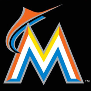
The logo wasn't ever really talked about. It was just, the Fish's logo. It worked for the team and no one ever complained about it. The fish in the logo had a real life representation called "Billy the Marlin." He served as the Marlins mascot at games and viewing parties. Now, here is where the dilemma comes into play. The new logo was leaked in late September 2011 and was hated by basically everyone. This is the new logo:
Coolest...logo.........ever?
Not really. Not to everyone. Suddenly, the logo was a huge deal. "How could they do this? The old logo was fine!" The old logo was fine, but that doesn't mean this one isn't either. People expected the Fish to keep the old logo. Why would they?! I mean seriously. New ballpark, new name, new location, possibly a new overall team...why keep the old logo? The point of moving the team is to start fresh; remove the old image of the Marlins and create a new, contemporary one.
I'm no artist, at least not a good one. Not one that knows about all that artsy stuff. So I asked the opinion of someone who does know about all "that stuff." My good friend Juan, an up and coming graphic artist, had this to say about the logo:
"Ok, so from my point of view, I see that the logo was planned out good. The choice of colors is great, as blue and orange are complimentary to each other, so they stand out more. The simple M ensures the logo can be reproduced largely, but also its colors make it easy to recognize even from a distance. The actual Marlin is a simplified form that works good with the simplicity of the logo, and also helps to animate the logo in an easier way (ie, when you saw the marlin going through the buildings. That would've been nearly impossible to do with the old marlin). Overall, I can see that a lot of thought was put into the logo."
I agree. The logo works. The logo is what Miami is. It represents the transition well. It's different, distinct, and bold. It's easily recognizable from a distance, and looks nice on uniforms. Here's a picture of how it's used on the uniforms:


From left to right: Hanley Ramirez SS, Josh Johnson RHP, Omar Infante 2B
They aren't playing in Miami Gardens anymore. The days of teal are over. A sea of empty orange seats are in the past. How dare I speak like that? Lets face it. I love the Marlins. I grew up watching Florida take the field for years on end. I'm as big a Fish fan as anyone in Miami. My room is covered with the Florida Marlins logo. I love teal, and I have amazing memories at the ol' football stadium. But the new look is just so... refreshing. The old logo represented fish...fish...just fish. The teal, black and grey represented fish. The new look represents the fish AS WELL AS the Miami atmosphere. The orange "represents the Miami sunset as well as the orange industry." The yellow represents "The Miami sunshine." The OCEAN blue "represents the cool waters of Miami reflecting the Miami sky."
It's fresh. What more can I say? Deal with it, because the new uniforms and gear are selling like hot cakes, very delicious hotcakes. For further representation:

Delicious
© 2001-2011 MLB Advanced Media, L.P. All rights reserved.
The following are trademarks or service marks of Major League Baseball entities and may be used only with permission of Major League Baseball Properties, Inc. or the relevant Major League Baseball entity: Major League, Major League Baseball, MLB, the silhouetted batter logo, World Series, National League, American League, Division Series, League Championship Series, All-Star Game, and the names, nicknames, logos, uniform designs, color combinations, and slogans designating the Major League Baseball clubs and entities, and their respective mascots, events and exhibitions.
No comments:
Post a Comment